QR code program analytics
A QR program generates more genuinely new information than any other system a manufacturer runs, and most brands use about a tenth of it. The scan count on the dashboard is the least interesting number in the dataset.
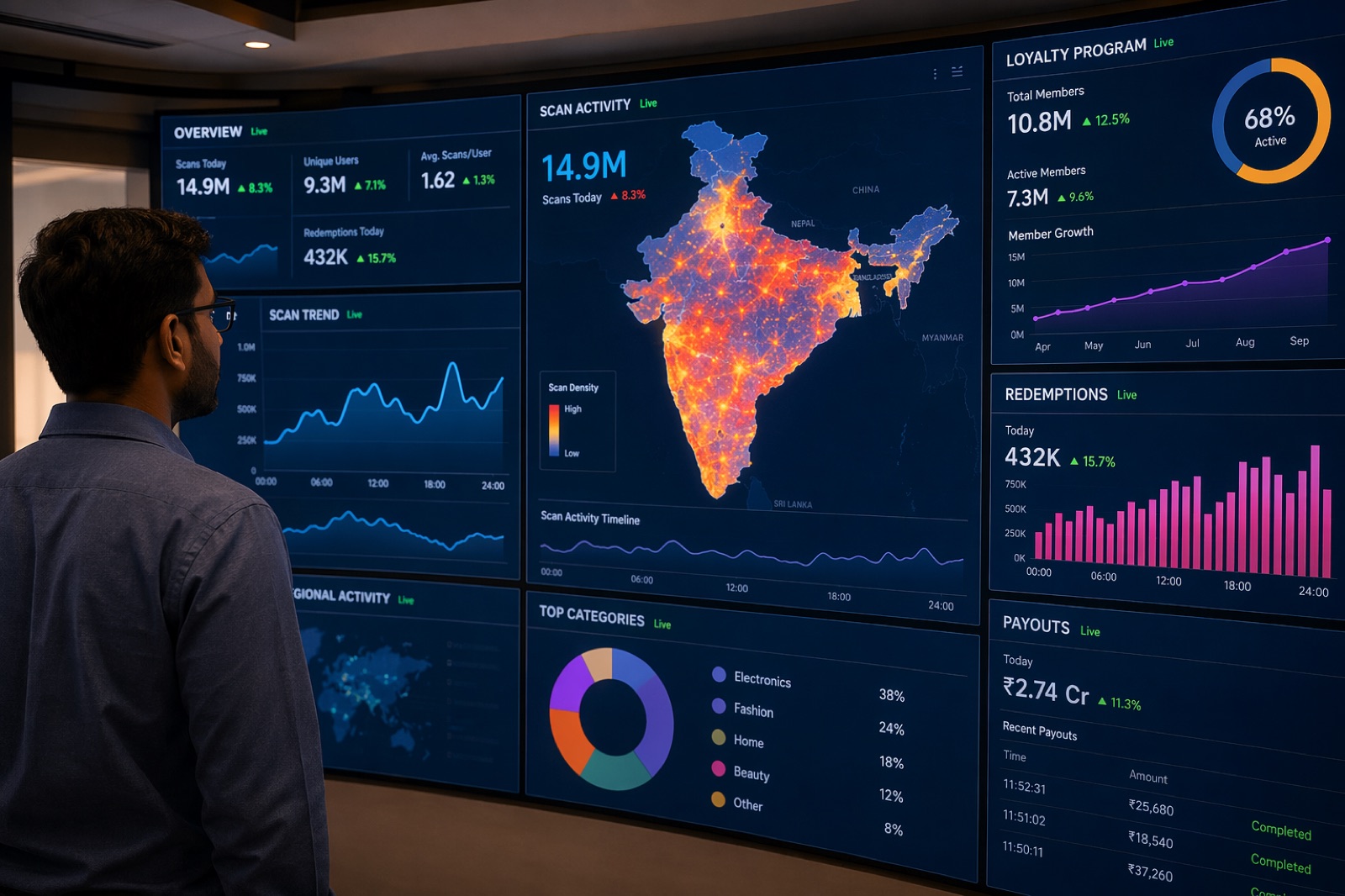
Every QR scan records which SKU, which batch, which member, which location and what time. Aggregated, that answers questions no ERP or distributor report can: where stock actually landed versus where it was invoiced, which districts are growing, which counters have real influencer relationships, where counterfeits are circulating, and which members are about to churn.
Five things only scan data can tell you
Where your stock actually went
You invoice a distributor and see one number. Scans resolve that number into districts, pin codes and counters. The gap between where you thought volume landed and where it actually landed is, in our experience, the single most surprising output of a first-year program — see secondary sales tracking.
Which counters have real influencer relationships
Scan clusters around a counter tell you which shops genuinely command tradesman loyalty, independent of what they purchase. That is a different and more useful map than a sales ranking.
Where counterfeit product is circulating
Invalid-code scan clusters are a live counterfeit map, usually months ahead of field reports. Route it weekly to brand protection.
Which members are about to leave
Scanning frequency decays before a member churns. A member whose weekly scan count halves for three consecutive weeks is leaving, and is recoverable now and not in two months.
Real SKU mix at the point of installation
Not what was ordered — what was actually installed, by geography and season. This is the closest a manufacturer gets to observing demand directly.
The dashboard most brands should build
| Panel | Question it answers | Refresh |
|---|---|---|
| Scans by district and SKU | Where is volume actually landing? | Daily |
| Enrolment funnel | Are new members reaching their first scan? | Daily |
| Cohort retention | Are members from March still scanning in August? | Weekly |
| Payout success and latency | Is the money arriving? | Real time |
| Redemption backlog and liability | What do we owe, and is it growing? | Weekly |
| Invalid-scan clusters | Where are the fakes? | Weekly |
| Anomaly and fraud queue | What needs a human? | Daily |
| Revenue share from scanning members | Is any of this incremental? | Monthly vs control |
That last row is the only one that answers whether the program should exist. Everything above it measures activity; only a comparison against control districts measures return. Method in loyalty program ROI calculation.
The metrics that mislead
- Total scans. Rises with distribution, seasonality and fraud. It is a vanity number in isolation.
- Total enrolled members. Enrolment without first scan is a sign-up, not a member. Report active scanners.
- Points issued. A liability, not an achievement.
- App downloads. Correlates poorly with engagement in this segment, where WhatsApp carries most of the journey.
- Average reward per member. Averages hide the distribution that matters — a few high earners can mask a dormant base.
Cohort analysis is the technique that pays
Group members by the month they enrolled and track what share are still scanning at month three, six and twelve. This single view answers questions that aggregate numbers actively obscure:
- Is the program getting better or worse at retaining members over time?
- Did the reward-rate change in April help or hurt the members who joined after it?
- Are counter-assisted enrolments retaining better than poster-driven ones? (They usually are, substantially.)
- Which districts retain, and what is different about them?
A program with rising enrolment and falling cohort retention is dying while its headline numbers improve, and that is a common and expensive pattern to miss.
Data quality problems to expect
- Offline scans arriving late, distorting daily numbers. Report on scan timestamp, not sync timestamp.
- Location precision varying wildly between devices and indoors. Aggregate to district rather than trusting coordinates.
- Duplicate members from a changed phone number. Deduplicate on PAN or bank account where available.
- Seasonal confounding. Construction seasonality will look like program performance if you do not control for it.
- Survivor bias in any analysis of active members. The interesting population is usually the one that stopped.
The full measurement set is in loyalty program KPIs and metrics.
Frequently asked questions
What data does a QR code program generate?
Every scan records the SKU, batch, member identity, location and timestamp. Aggregated, that reveals where stock actually landed versus where it was invoiced, which counters command real influencer loyalty, where counterfeits are circulating, which members are about to churn, and the true SKU mix at the point of installation.
What is the most useful QR program metric?
The share of business coming from scanning members, tracked against a control set of districts where the program does not run. Everything else — scan counts, enrolment, points issued — measures activity. Only a comparison against a control measures whether any of it is incremental.
Which QR program metrics are misleading?
Total scans, which rises with distribution, seasonality and fraud alike; total enrolled members, since enrolment without a first scan is a sign-up rather than a member; points issued, which is a liability; and app downloads, which correlate poorly with engagement where WhatsApp carries most of the journey.
How does cohort analysis help a QR program?
Grouping members by enrolment month and tracking what share still scan at three, six and twelve months reveals whether the program is getting better or worse at retention, whether a rate change helped, and which enrolment routes retain best. A program with rising enrolment and falling cohort retention is dying while its headline numbers improve.
Can QR scans replace secondary sales reporting?
They give a different and often better view. Distributor reports tell you what was invoiced; scans tell you where product was actually opened and installed, by district and pin code. The two rarely agree, and the gap is usually the most valuable output of a first-year program.
What data quality problems affect scan analytics?
Offline scans arriving late and distorting daily numbers, so report on scan timestamp rather than sync timestamp; location precision varying between devices and indoors, so aggregate to district; duplicate members from changed phone numbers; seasonal confounding; and survivor bias when analysing only active members.